
Study Shows Election Data Visualization Design Can Be a Powerful Persuasion Tool
From election forecasts and pandemic dashboards to stock market charts and scientific figures, many people trust data visualizations as objective truths and neutral representations of reality.
However, a study led by Georgia Tech and University of California, Berkeley researchers shows that annotations can lead people to draw different conclusions from the same visualizations. Their findings suggest readers should look beyond the presented data to make informed decisions.
“People question things less if they see something that’s visualized, and they think this is a reliable, trustworthy source they can use to form an opinion or persuade others,” said Cindy Xiong, an assistant professor in the School of Interactive Computing. “People don’t realize the persuasive power of visualization, and they’re not as vigilant to critically think about the data they interact with.”
For example, people tend to trust the information in an election data visualization. That makes them susceptible to narratives that visualization designers may use to obtain a certain outcome.
Working with Chase Stokes, a Ph.D. candidate at UC Berkeley’s School of Information, and his advisor, Professor Marti Hearst, Xiong investigated how text position, semantic content, and biased wording impact viewers’ perception of visualizations.
They found people often reach the same conclusions suggested by titles and annotations on a chart.
“Visual changes have a great deal of impact on how people interpret a chart,” Stokes said. “Titles, captions, and annotations strongly affect people’s conclusions.”
Xiong and Stokes created a study centered around two hypothetical political parties — a blue party and a green party. They used a bar chart to show how many votes each party has received over the past three years. The data shows the blue party received more votes year after year than the green party, but the gap has closed each year.
The researchers surveyed participants to predict which party would win in the fourth year. Responses were split nearly 50-50 before leveraging highlights and annotations.
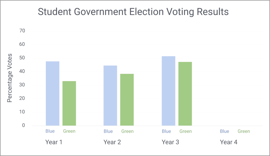
When the researchers highlighted the green party’s increasing voter support year after year, the prediction responses overwhelmingly favored the green party. Predictions favored the blue party when the researchers highlighted blue had won every year.
Existing Bias
While the scenario created by Xiong and Stokes reflects an ideal world of neutrality, the researchers concede that existing beliefs about political parties play a strong role in determining real-world bias. Participants consistently reported charts that supported one of the two parties were biased, and that perception intensified if the participants disagreed with the text provided.
“If I supported the green party, and I saw this chart, I would think blue party supporters made it because it’s supporting the side that I don’t agree with,” Stokes said.
“If the chart represented Republicans and Democrats, many people would perceive the data in a way that reinforces what they already think. If they disagreed with the party’s ideologies, they would likely see the visualization as biased regardless of its portrayal.”
Designer Responsibility
Xiong and Stokes found that although textually annotated data patterns do not strongly sway people’s predictions to favor one party over another, they make people suspicious of the designer’s beliefs.
“It’s easy to make a chart that alienates half the people you’re trying to reach,” Stokes said. “Figuring out a way to make data accessible, understandable, and interesting to people who may not agree with your story is critical to mending that trust between designer and consumer.”
For example, someone who trusts the information presented to them on Fox News may not trust what they see in The New York Times. Designers must account for the distrust between the public and information sources when creating their visualizations.
“The solution to reaching the widest possible audience is to provide both sides of the story, even if the designer wants to persuade people toward a certain perspective,” Xiong said.
“If you are making visualizations for a political candidate, it’s difficult to persuade people that you’re not biased. You could visually highlight your key takeaways. But adding textual annotations to your chart will make people think you’re pushing hard for some narrative.”
Staying Informed
Voters, meanwhile, should be aware that most visualizations contain bias. The researchers agreed voters should gather information from various sources, including those that don’t align with their opinions.
“Voters should look for visualizations that talk about both sides and give you those different perspectives so you can make informed decisions about your future,” Stokes said. “If you see a visualization that highlights one story, you should respond by finding the other side. There’s never just one interpretation of a visualization.”
Xiong and Stokes published their findings in a paper that is being presented this week during the Institute of Electrical and Electronics Engineers’ Visualization and Visual Analytics (VIS) Conference.


As computing revolutionizes research in science and engineering disciplines and drives industry innovation, Georgia Tech leads the way, ranking as a top-tier destination for undergraduate computer science (CS) education. Read more about the college's commitment:… https://t.co/9e5udNwuuD pic.twitter.com/MZ6KU9gpF3
— Georgia Tech Computing (@gtcomputing) September 24, 2024